

Branding customization
Color #
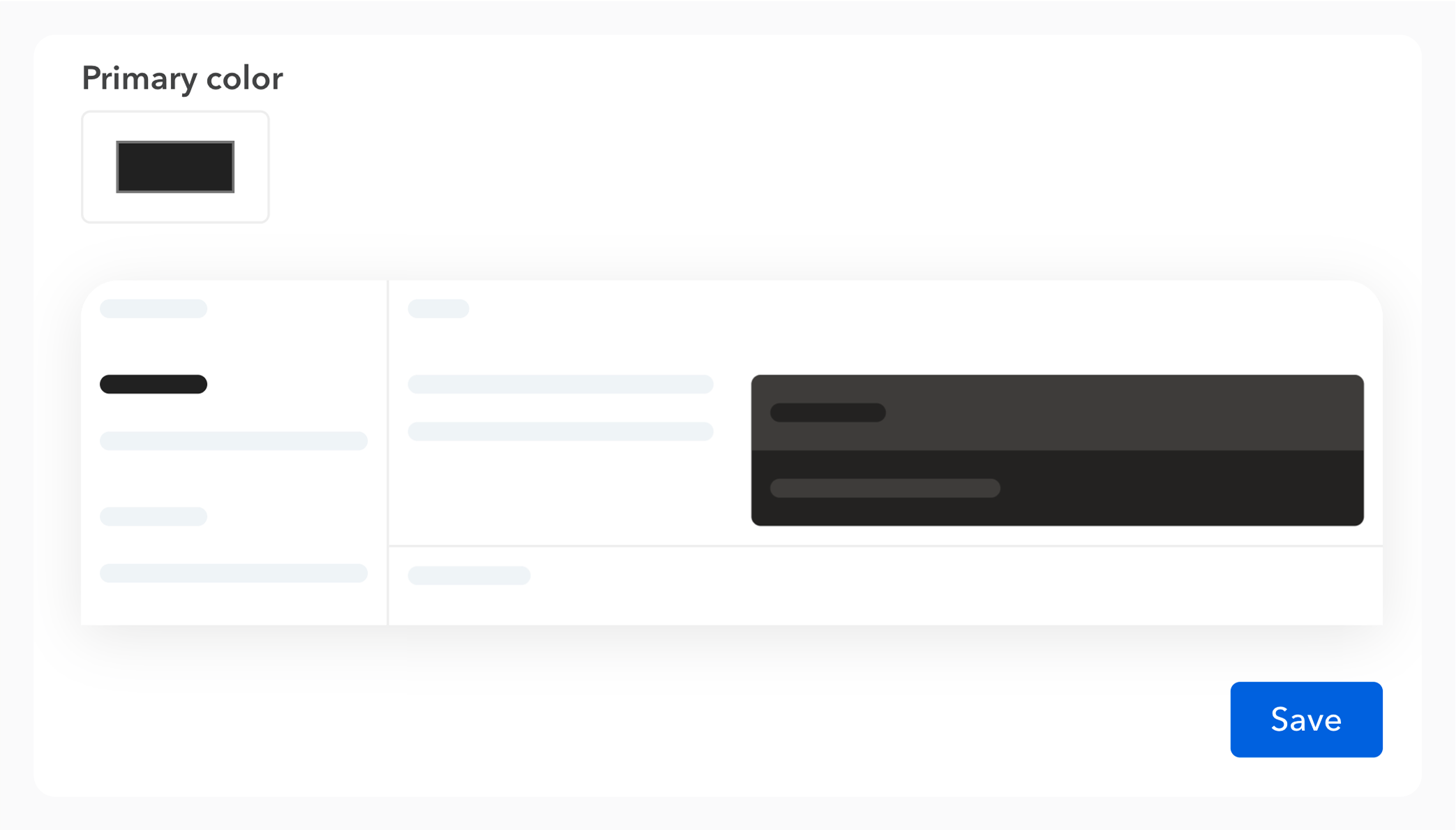
From the “Customize UI” tab in your documentation settings, you can select a color scheme to apply to it, better reflecting your brand.
A preview allows you to anticipate the readability of the final rendering.
Logo and favicon #
You can upload your own logo and favicon on Bump.sh to customize your documentation with your brand or project colors.
From the “Customize UI” tab in the documentation settings, you can add your own logo and favicon.
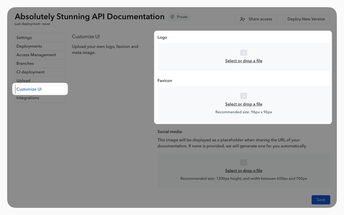
To provide the best image quality, it is recommended to adhere to the following dimensions for your logo: 140px*36px. Other dimensions will be adjusted by our renderer.
Dark mode #
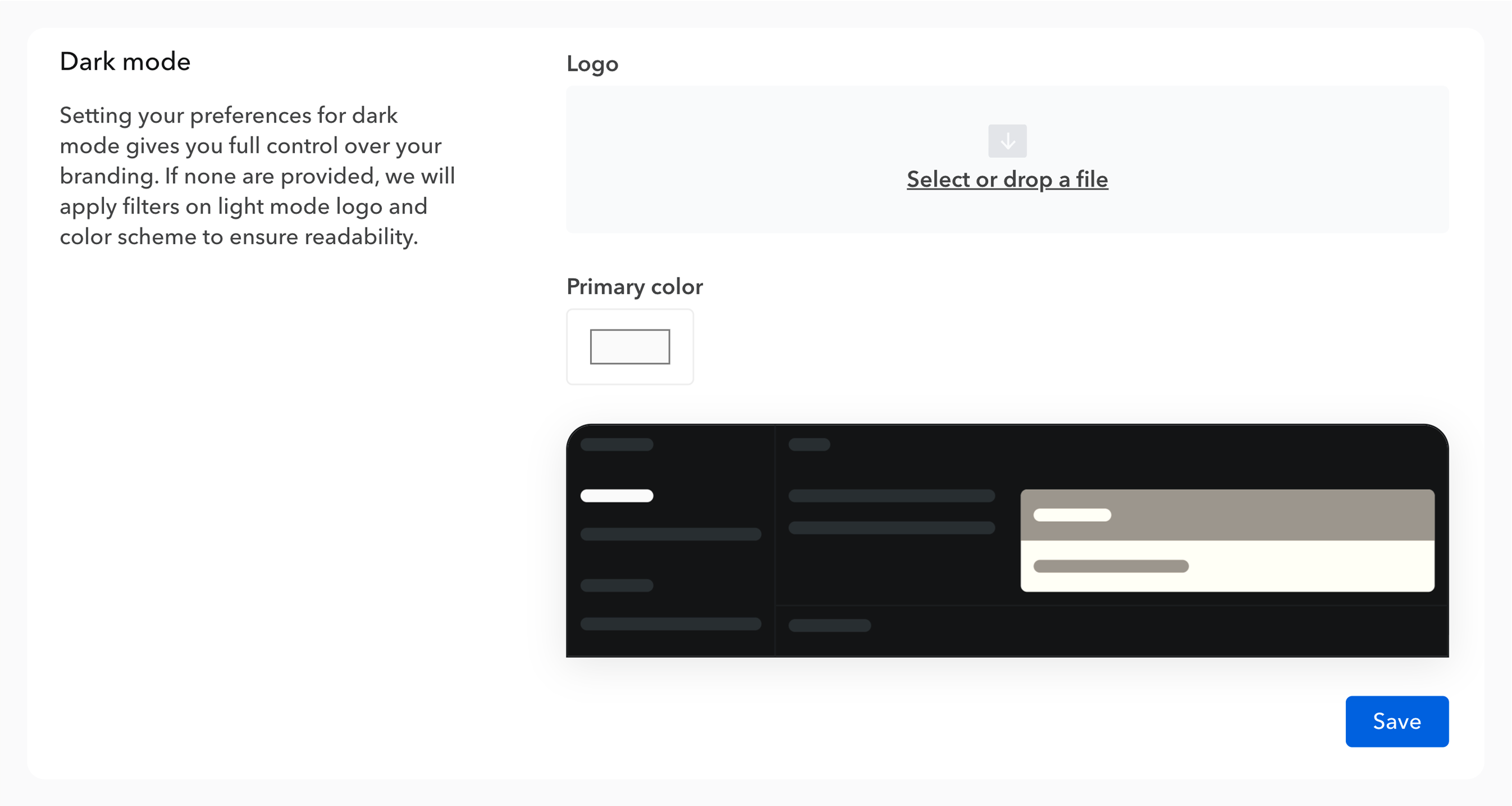
By default, we apply filters to make your light mode color and logo blend in dark mode. To ensure brand consistency, you can define a custom logo and color dedicated to dark mode.
Social media image #
A social media image, also known as “meta image”, typically refers to an image that is used as a preview image when a web page is shared on social media platforms and can be displayed in search engine results.
Social media images help make the links posted on social media platforms more attractive, especially when shared or displayed in posts.
By default, Bump.sh will automatically generate a social media image that can be changed to your own later on.
Use the automated image generation #
In case you don’t have a visual you could use, Bump.sh will automatically generate a meta image that will display your documentation name, logo and API type. First generation of this new social media image may take a bit, but any modification or change will start the generation process.
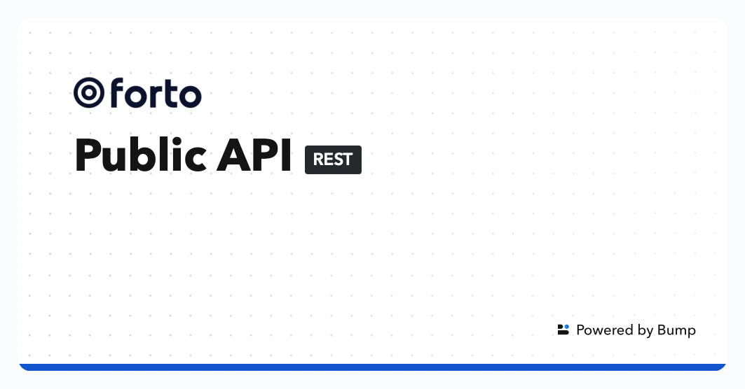
The social media image will be modified each time you change the name or the logo.
Add your own image #
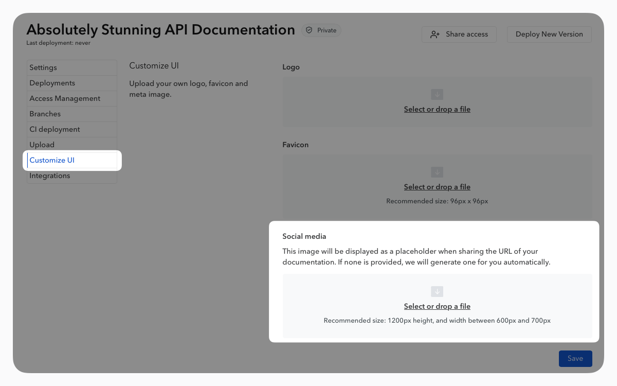
From the “Customize UI” tab in the documentation settings, you can add your own social media image.
It is advisable not to exceed a width of 1200px and to maintain the height between 600px and 700px for better integration on most platforms.
Advanced customization through CSS variables #
Deep customization options are available in our custom plans.
Bump.sh offers deeper customization options, offering full control of your branding. It makes your Bump.sh doc portal truly blend in with your platform.
Custom CSS can be added either through a reverse proxy you’ve set up (by injecting these variables in the head section of documentation), or managed by Bump.sh. Feel free to contact us so we can assist you.
If you customize fonts, make sure to use a font that is available on the user’s device, or loaded in your custom headers.
Supported variables #
You can safely customize the style of your doc portal using these CSS variables:
| Variable | Role |
|---|---|
--font-family |
the global font family |
--heading-font-family |
the font family used for headings (h1, h2, h3, …). If none is defined, the global font family is used |
--code-font-family |
the font family used for code blocks and examples |
--doc-base-color |
the primary color, used for links, buttons and verb pills. Can also be set in the documentation or hub settings |
--doc-soft-color |
the soft tint used for the active navigation entry, selection, labels and chips |
--text-color |
the color used for body text |
--title-color |
the color used for headings |
--page-background-color |
the page background color |
--page-background |
the full page background. Also accepts a gradient |
--code-background-color |
the background color of code blocks and examples, dark in both themes |
--code-text-color |
the text color of code blocks and examples, dark in both themes |
--doc-font-size |
the global font size. The default value is 14px |
--code-font-size |
the font size used on code blocks and examples. The default value is 12px |
--nav-font-size |
the font size used on side and top navigation bars. The default value is 14px |
--doc-font-weight |
the default font weight. The default value is 500 |
--nav-font-weight |
the font weight used on side and top navigation bars. The default value is 500 |
--logo-width |
the logo width, if the default width doesn’t fit your logo |
--logo-height |
the logo height, if the default height doesn’t fit your logo |
How overrides are applied #
- Any override you declare wins over default values, as long as it isn’t placed in a CSS
@layer. :rootstyles the light theme. The dark theme keeps its own default values unless your override is scoped under.dark-theme:
:root {
  --doc-base-color: #1c64f2;
}

.dark-theme {
  --doc-base-color: #76a9fa;
}
You could also apply your own custom CSS, but keep in mind:
- We don’t guarantee the stability of HTML or CSS class names
- Custom overrides might break if we update the rendering engine
The Embed mode is an even more advanced way to integrate Bump.sh with your existing doc sites and branding.
We are always open to adding more customization options: if you need to customize other parts of the UI, just send us a message and we’ll add the required CSS variables.
Hub customization #
All of these customization settings can be applied to all the documentation within a hub.
These options are available directly in the “Customize UI” tab in the hub settings.
Edit this page on GitHub