

Your API docs get a refresh
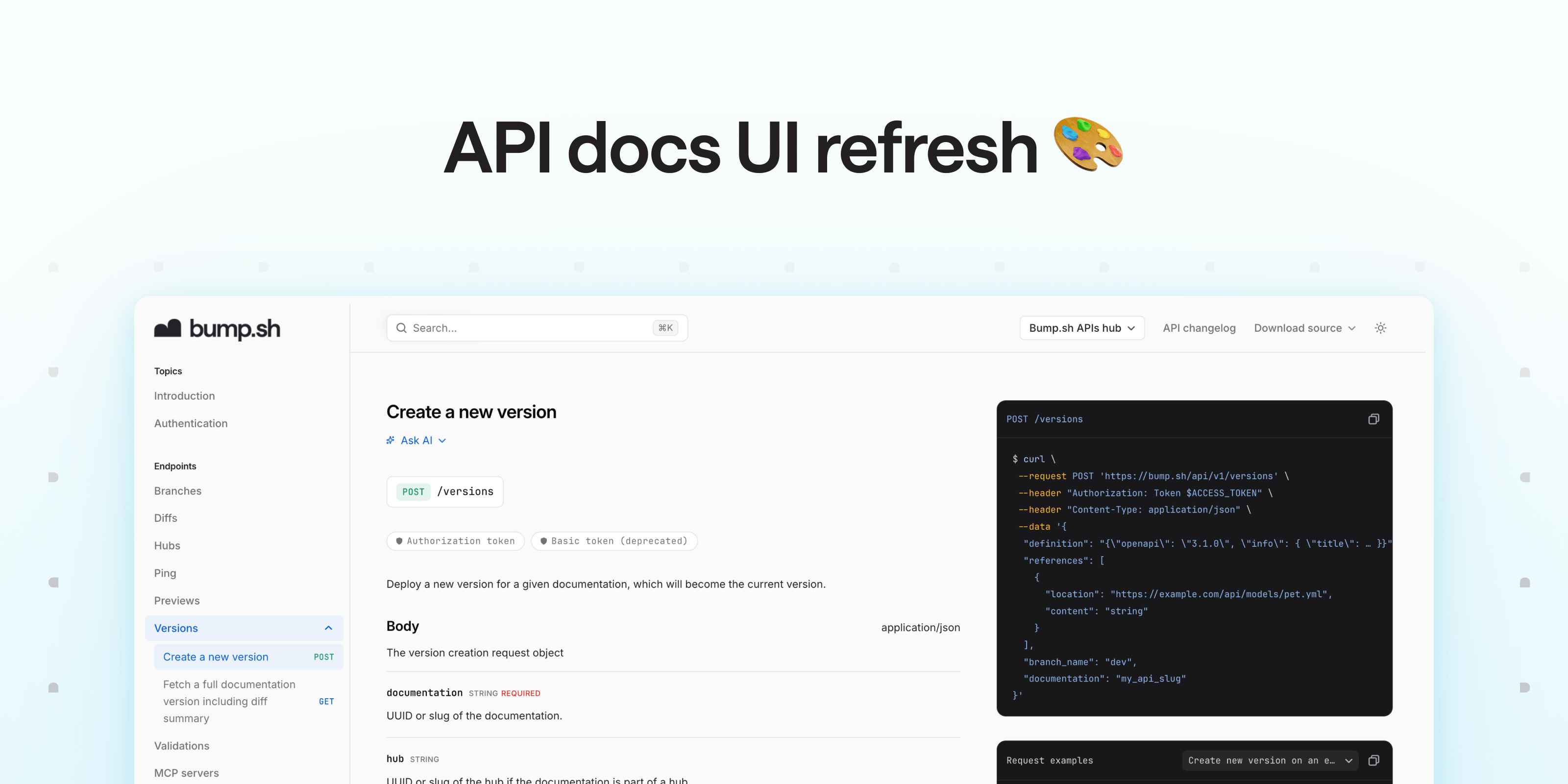
Most of the attention right now goes to making APIs readable by AI tools. But agents aren’t the only ones who use your APIs: developers still are. They read your documentation, scan response bodies, look for that one specific parameter, trying to understand the big picture. And that part of the experience hasn’t changed that much on Bump.sh.
So we refreshed the UI with one focus: making your docs easier to scan. It comes with a new type scale, a new color palette and an improved dark mode. It’s live across your whole doc portal: docs, hubs, API Explorer and changelog.
Built to be quickly scanned #
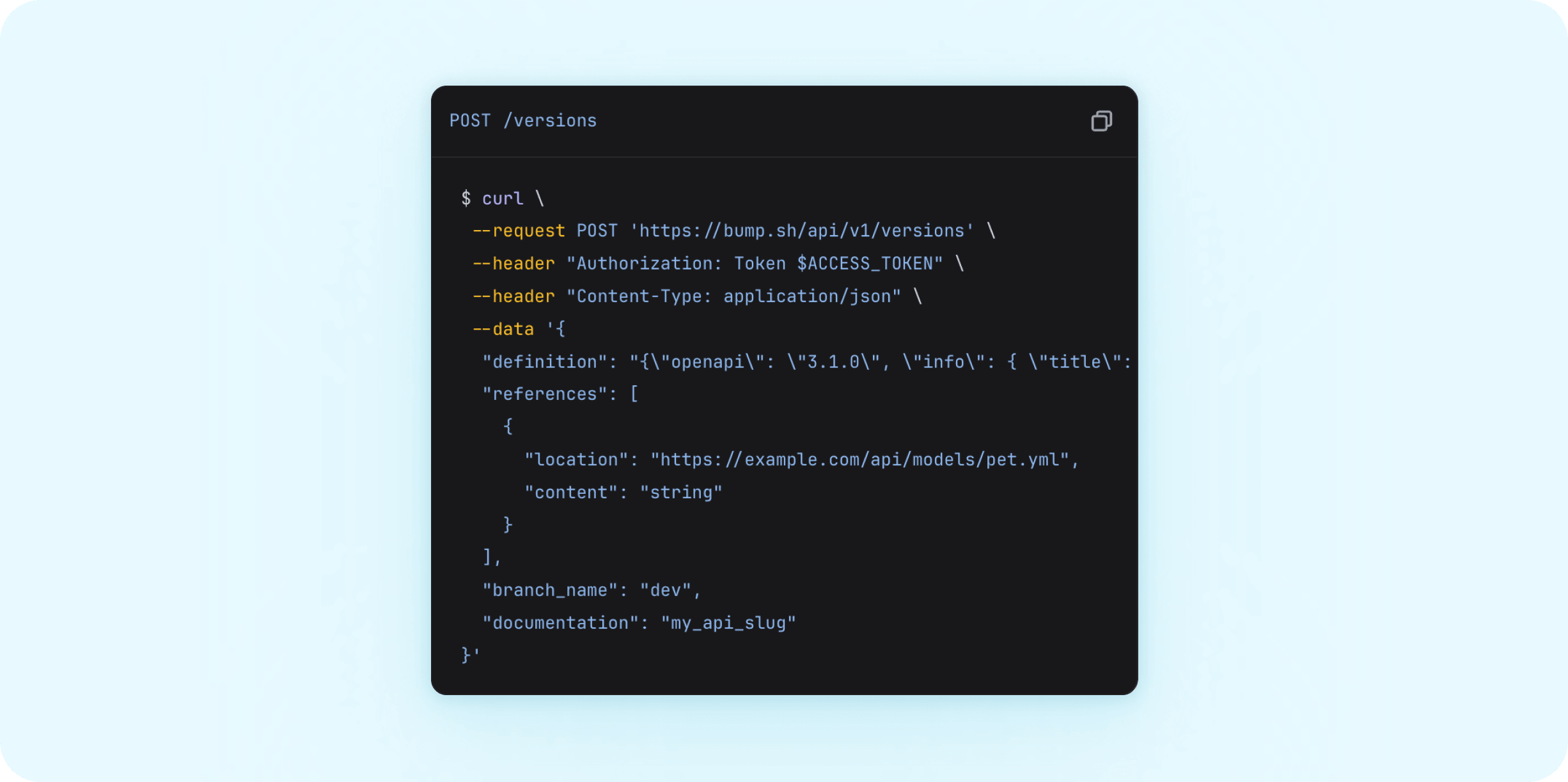
The type scale has been reworked around Inter for the interface, and JetBrains Mono for everything code-related (think anything you would paste into a terminal).
Content is tighter too. More of your API fits on one screen, without the scrolling that comes with oversized line height and padding. Tighter doesn’t mean harder to read: the visual hierarchy was reworked so the important bits stand out.
Examples now sit on neutral, high contrast surfaces, and read the same way in light and dark mode, whatever your brand color.
Improved dark mode #
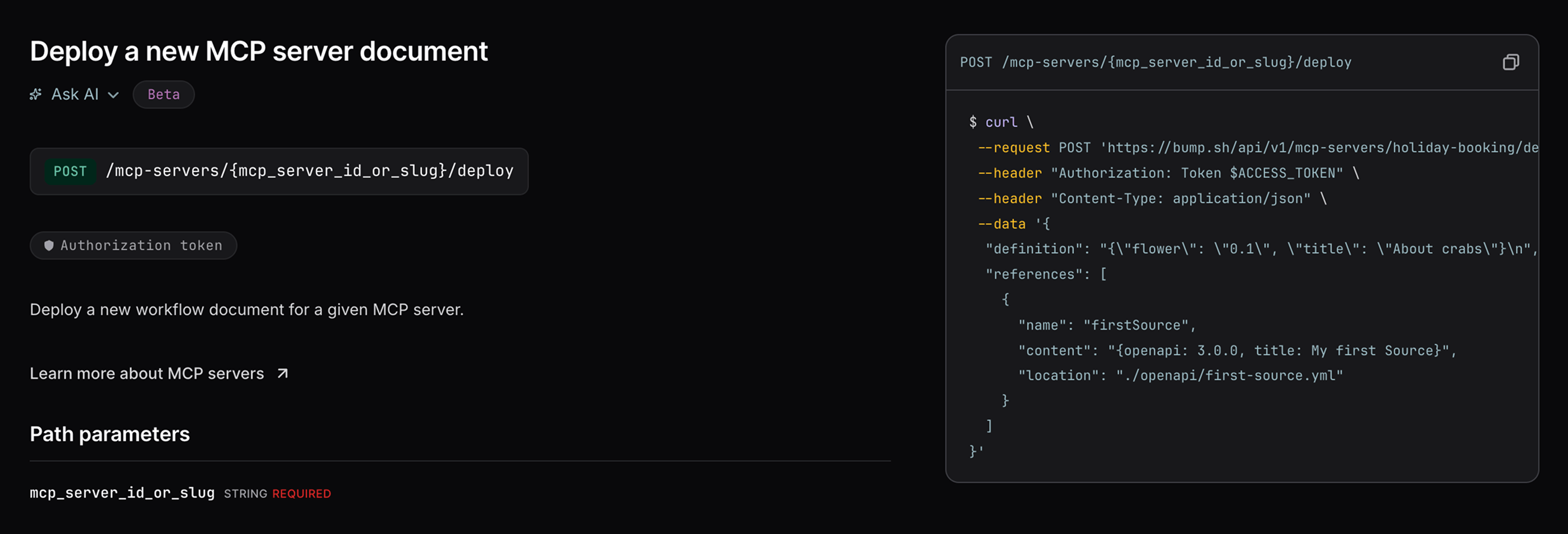
Dark mode no longer relies on filters applied to the light theme. Surfaces, badges and code samples get their own colors in each theme, picked with accessibility in mind. Your brand color (and your dedicated dark mode color, if you set one) still drives accent colors, hover states and text variants, adjusted so text stays readable.
Using custom CSS? #
If you use custom CSS or Embed mode, check your overrides: the supported CSS variables still apply, but custom selectors may need an update.
Any feedback on the new theme? Reach out to hello@bump.sh.